The Palette
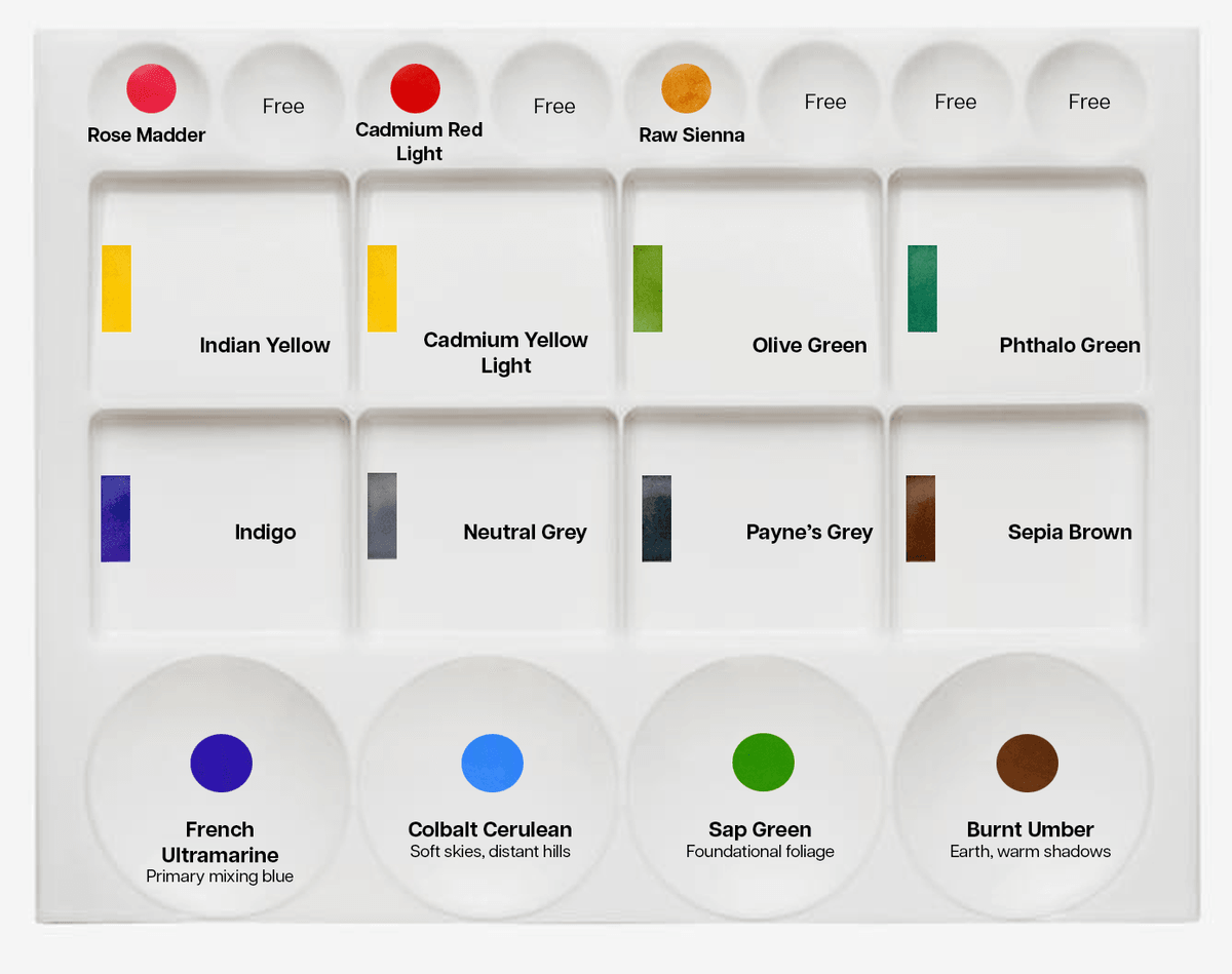
Color layout for all sessions*.
*In other workshops, we will introduce other palettes and mixing areas such as inks, dyes, and granulated paints.
For most sessions we use Horadam Aquarell. These paints delivers a contemporary, professional palette with an exceptionally broad color range and the consistency and pigment strength demanded by advanced practice and experimental techniques.
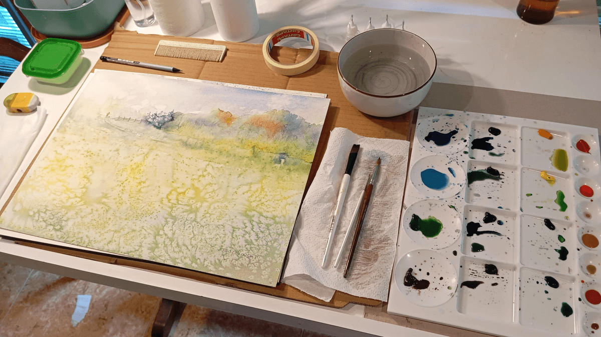
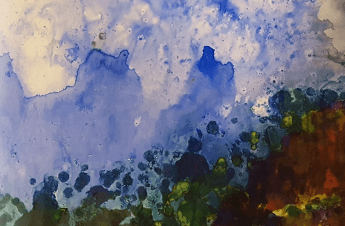
"Gates Edge" Watercolor, 12x16 in (31x41cm) using salt technique from
"Texture Lab" worshop.
This custom watercolor palette was designed for clarity, balance, and intuitive mixing, a structure that mirrors how painters think and move through color. It’s organized into three distinct zones that guide both teaching and practice: eight small circles at the top for accent hues and mixing spaces, two rows of four equal squares in the middle for core mixing, and four large circles at the bottom for foundational landscape pigments.
Palette Structure
Top Row, Accent Colors & Mixing Spaces
- Rose Madder: Soft, transparent pink for floral and atmospheric warmth.
- Cadmium Red Light: Bright, energetic red for focal accents.
- Raw Sienna: Earthy tone for underpainting and warm neutrals.
- Mixing Spaces (x5): Reserved wells for blending and experimentation.
Middle Section, Core Mixing Zone
Row 1 (Warm → Green):
- Indian Yellow: Deep, glowing yellow for sunlight and warmth.
- Cadmium Yellow Light: Clean, bright yellow for clarity and lift.
- Olive Green: Muted green for natural foliage and shadow tones.
- Phthalo Green: Cool, high chroma green for vibrancy and contrast.
Row 2 (Cool → Neutral):
- Indigo: Deep blue for atmospheric depth and shadow.
- Neutral Grey: Balanced tone for desaturation and value control.
- Payne’s Grey Bluish: Cool, moody neutral for stormy skies and texture.
- Sepia Brown: Rich, dark brown for grounding and structure.
Bottom Row, Foundational Landscape Pigments
- French Ultramarine: Primary mixing blue for skies and water.
- Cobalt Cerulean: Soft blue for distant hills and light washes.
- Sap Green: Foundational foliage color with natural warmth.
- Burnt Umber: Earth pigment for warm shadows and soil tones.
Design Rationale
This arrangement gives you a balanced, intuitive palette for landscape teaching, warm hues flow naturally into greens, cools anchor the lower middle, and the bottom row holds your most used pigments for skies, foliage, and earth.
The vertical mixing path encourages light to dark and warm to cool transitions, supporting expressive, granulation forward watercolor techniques. Each pigment was selected for its mixing versatility, granulation character, and teaching clarity, making this setup ideal for both beginners and advanced guests in your Color & Conversations sessions.
Teaching Application
This palette supports vertical color logic, students can mix directly down the rows to explore temperature, value, and granulation. It’s ideal for demonstrating how pigments interact across warm cool and light dark spectrums. The layout also simplifies cleanup and reinforces intuitive mixing habits. See my watercolor supplies that I use in the workshops and in my studio.

Thanks for stopping by...
Curated art experience designed for boutique hotels and private events.